Using Kibana for Wi-Fi monitoring in Souly deployment
Providing your own Wi-Fi Access Points (AP) for a dense deployment requires a proper monitoring for management of the APs. In our smart building system Souly [1], one of the IoT gateway function is Wi-Fi AP to deliver Internet access for the tenants. As each room, in a student dormitory is equipped with such piece of hardware, we get a high density and high capacity network. In order to properly operate such network, we designed a custom monitoring and analytics solution based on Elastic Stack [2] and MQTTbeat [3] receiving the measurements from all 494 IoT gateways (i.e. 494 Wi-Fi APs) through an MQTT broker. In this post I’m going to shed some light on the different aspects of the solution.
The measurements
The set of parameters we get from all APs include:
- DL & UL traffic;
- Number of connected STAs and their addresses;
- AP location (Room & Floor);
- Wi-Fi channel and Tx power set per radio interface (2.4GHz and 5.8GHz);
- SSID;
- AP IP and MAC address.
As you can see, not too much, but enough to get meaningful dashboards, which provides us with enough insights to run proper troubleshooting. The information is stored under a single index in Elasticsearch, from which we build a number of visualisations. In later stages we are going to expand this to obtain more info, such as interference levels, Rx power levels, MCSs, etc.
The sketch
Prior to using Kibana visualisations, filters and dashboards, we’ve sketched the different graphs and parameters, we want to get analysed and monitored.
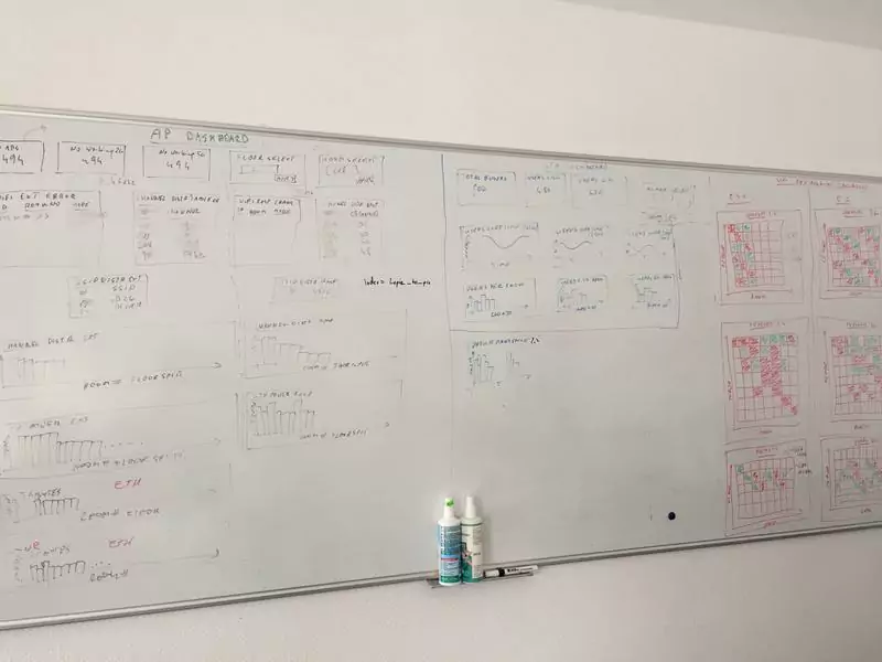
Fig 1. Wi-Fi monitoring sketch
The following set were selected and is shown in the figure above:
| Collective AP dashboard |
General overview of the system and main parameters for all APs at once |
| Collective STA dashboard |
General overview of the STAs and their distributions in different rooms |
| Environmental dashboard |
Overview of all the APs and STAs within the building with the main parameters for the general troubleshooting and system overview |
| Individual AP dashboard |
Individual set of parameters of a single AP with an “over-time” manner |
| Individual STA dashboard |
Individual AP location in the building for troubleshooting purposes |
The next step was to put those in Kibana as custom made visualisations and gather them creating “dashboards”.
Dashboards
Based on the parameters set, received events in Elasticsearch, the sketch from previous section, and the possible types of visualisations using Kibana, the 5 custom dashboards were developed. Below short descriptions of those are provided, along with example screenshots as per previous section.
Note: those are subsets of all parameters, details and visualisations that are available in the production system for illustrative purposes. If you are interested in more details or need a customised solution for monitoring based on elastic stack, please contact us at info@grandmetric.com
Collective AP dashboard
The first dashboard (see Fig. 2 below) allows an operator (or a Customer Engineer) to get an overview of the current status of all the access points with the basic set of parameters, namely:
- how many users are connected,
- what is the status of the access point,
- which access points are getting most of the traffic,
- and what are the channel and power settings per band.
This allows to spot any misbehaving devices, high traffic situations, or any APs that are getting too many connections compared to others.
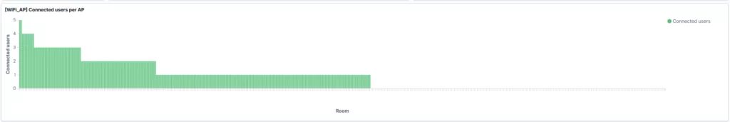
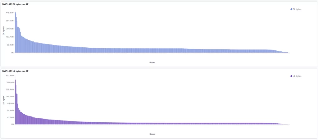
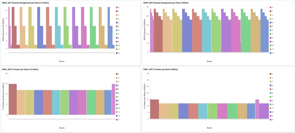
Fig 2. Collective AP dashboard
From the bottom of the figure, we could e.g., see that there are some APs with higher power than others – this is due to higher attenuation of the walls in floor 0 and 1 in the building, which are made of different material compared to upper floors. From the top, on the other hand, we could see that there are some rooms (and in turn APs), to which no users are connected and thus could be subject to entering power off/energy saving mode.
Collective STA dashboard
The second dashboard (see Fig. 3), shows the system from the perspective of connected clients (STA). The top part shows the total number of connected devices and the devices connected to individual rooms with split per floor and the user distribution over time. Immediately, the operator can see that there are some rooms with higher number of connected devices than in other places on each floor. This is the result of those rooms (and thus APs) being close to the elevator. This results in more users getting connected than for other APs. Thus, those can be subject to lowering the Tx power, to decrease their coverage, to avoid being temporarily overloaded, in turn decreasing the user experience of the users in those rooms. Secondly, we could see, the daily traffic pattern, where we get the peak at around 9pm and lowest traffic at 3pm.
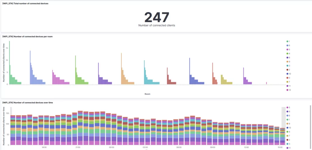
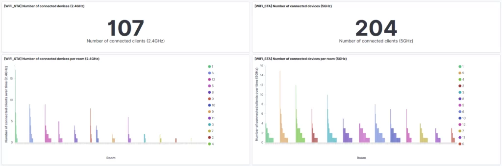
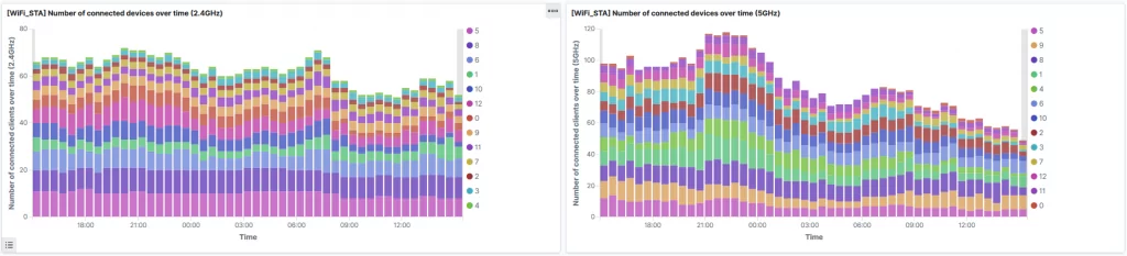
Fig 3. Collective STA dashboard
Additionally, the lower part of Fig. 3 shows the same thing, but from a different perspective, i.e. on a per band basis. We can see that there are more devices using 5GHz band than 2.4GHz band and also that the daily traffic pattern is slightly different between the bands – the 2.4GHz band distribution is more even, than the 5GHz one, where there is a high peak between 9pm and 11pm, while 1/3 of that between 12pm and 3pm. This can be result of stationary devices being equipped with 2.4GHz radios, while the mobile devices are more using 5GHz band (mobile phones). Also, interestingly, we can see that on different floors there is a different usage of those.
Environment dashboard
The environment dashboard merges both perspectives and shows gathered data in form of a heat map (see Fig. 4). In this way, you get a chopper view on what’s happening in the building by correlating different items. The dashboard presents heat maps per band, including: Wi-Fi channel, configured Tx Power and user distribution per room and floor. You get the building view, where you can identify e.g., that in certain rooms there are more users than in others, and that a different Tx power is used in some rooms compared to other rooms, which may affect performance. For instance, by having higher power in one room, users from neighbouring rooms may connect to this room and thus overload the certain AP.
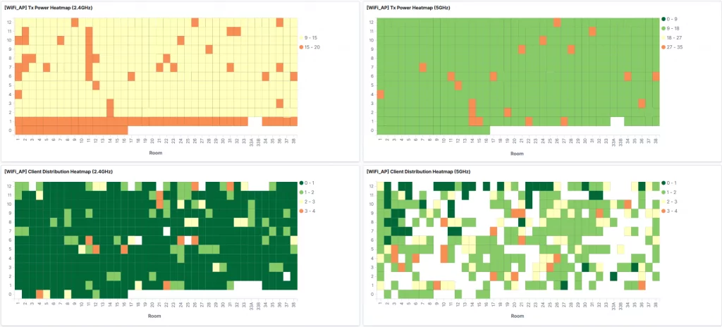
Fig 4. Environment dashboard
On the other hand, you can directly see, where are the users located in certain parts of the day. You also get the information (by blank/white spaces in the graph), how are the rooms distributed – i.e. that on floor 1, there are 38 rooms, where 33A and 33B are missing, compared to upper ones.
Individual AP dashboard
We’ve also created another view on what’s happening in the system, to enable looking on an individual AP. By selecting a room of interest, you get all the details from the perspective of an AP sitting there (see Fig. 5). The number of connected STAs over time, DL/UL data transmission and the configured parameters with separation between the Wi-Fi bands. This enables you to monitor individual AP usage and troubleshoot local issues. The over time graphs allow to e.g. identify, what is the connection density per radio interface.
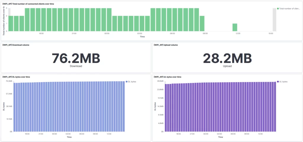
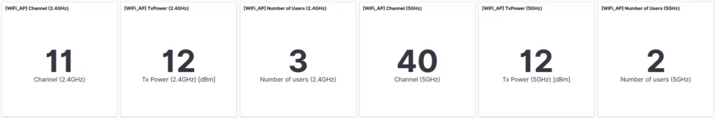
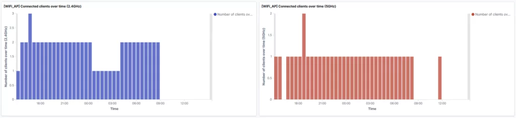
Fig 5. Individual AP dashboard
User’s presence dashboard
The final dashboard (see Fig. 6) presents the perspective of an individual STA (client), where you can see:
- at what time was a user connected to the network;
- where, i.e. to which AP/room was it connected;
- for how long was the user connected in the network.
The left-hand side shows the “over time” perspective. In this example, you can see that the user was connected mostly to APs in room 510 and 511, and sometimes to 512 and 611. The right-hand side allows to see that “on a map” distribution (i.e. histogram) of where the user was connected most of the time and where it was only connected “sometimes”.
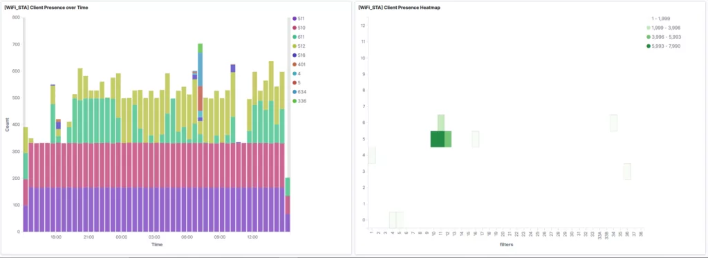
Fig 6. STA location dashboard
Those graphs are very useful for two reasons:
- first – for troubleshooting purposes, where you can immediately spot the cases where the user is “switching APs” – i.e. it should be connected to AP in room 511 (this is his room), but half of the time he is connected to room 510, and also he is connecting sometimes to room 611 (above him) and 512 (next to his room). This may be an indication of two things:
- either rooms next to him use higher power than his room, and thus the user switches to them (if you take a look on Fig 5., you can see that this is the case in rooms 611 and 512 where Tx power is higher than 511);
- or his AP is malfunctioning, thus he may get the “disconnection frames” from “his original” AP.
With this you can check out other parameters and other dashboards to see the where the problem occurs. You get the idea.
(Note: we may write another post on the AP logs dashboards somewhere in the future, where you can drill down such issues, but that’s another story.)
- second – for location purposes – having this data and views, you may use them to track users for different purposes – e.g., when you know this user is not in his room, you may switch-off some of the IoT features. When he enters the dormitory (i.e. when he shows up on floor 0), you can e.g., start heating-up to increase the temperature, or switch higher power on his AP being in a sleep mode when he is out. In this context, this is sort of a very precise indoor location tool.
Summary
Being able to design and utilize a custom-made monitoring and analytics allows to tailor the solution to your needs. Using a limited number of parameters and measurements allows creating different views on the same aspect, which can be used for different purposes – e.g. status view, troubleshooting, analytics, algorithms feeding, etc. Elastic Stack is very powerful in this context, by being very “elastic” in processing and visualising the data. Being able to monitor the situation in the described environment (13-floor and 494-room building) for managed Wi-Fi access is very important, where the user/STA and AP perspectives, as well as collective and individual room/STA views, are needed to troubleshoot different cases. In the same time, some features allow to use the parameters for different purposes as well, e.g. location or dynamic Wi-Fi parameters adaptation.
Note: this post describes one of the applications of Elastic Stack for our purposes. Another one on ticketing system can be found in [4].
Resources
[1] https://souly.pl/
[2] https://www.elastic.co/
[3] https://github.com/nathan-K-/mqttbeat
[4] https://www.grandmetric.com/visualising-tickets-using-kibana/


Leave a Reply